
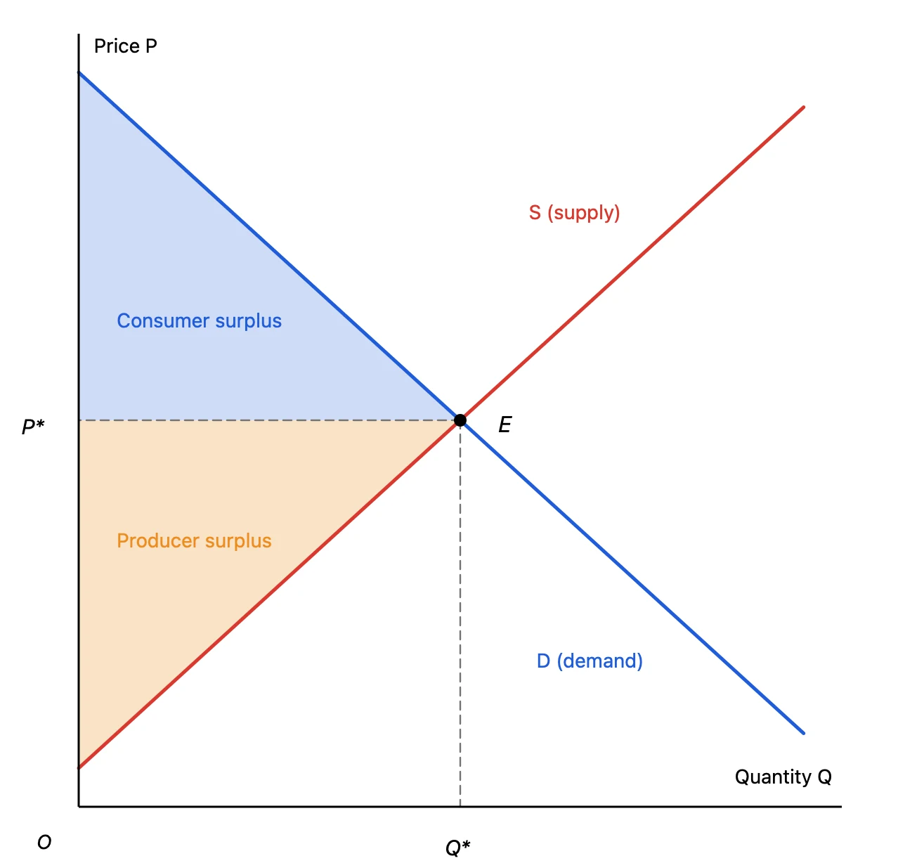
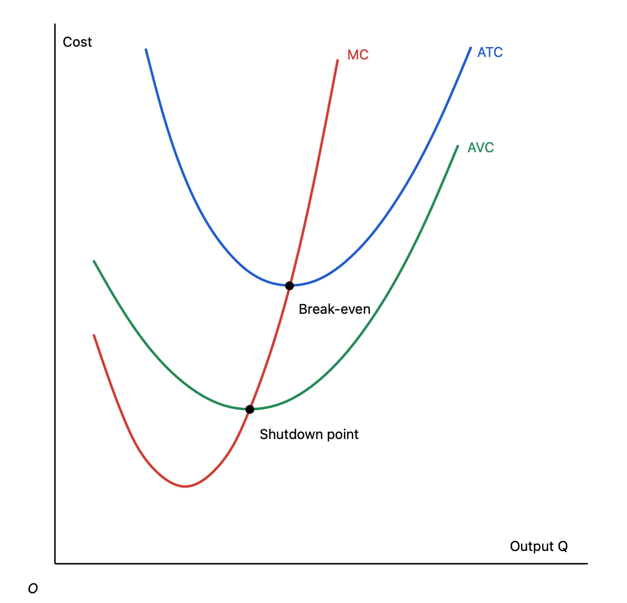
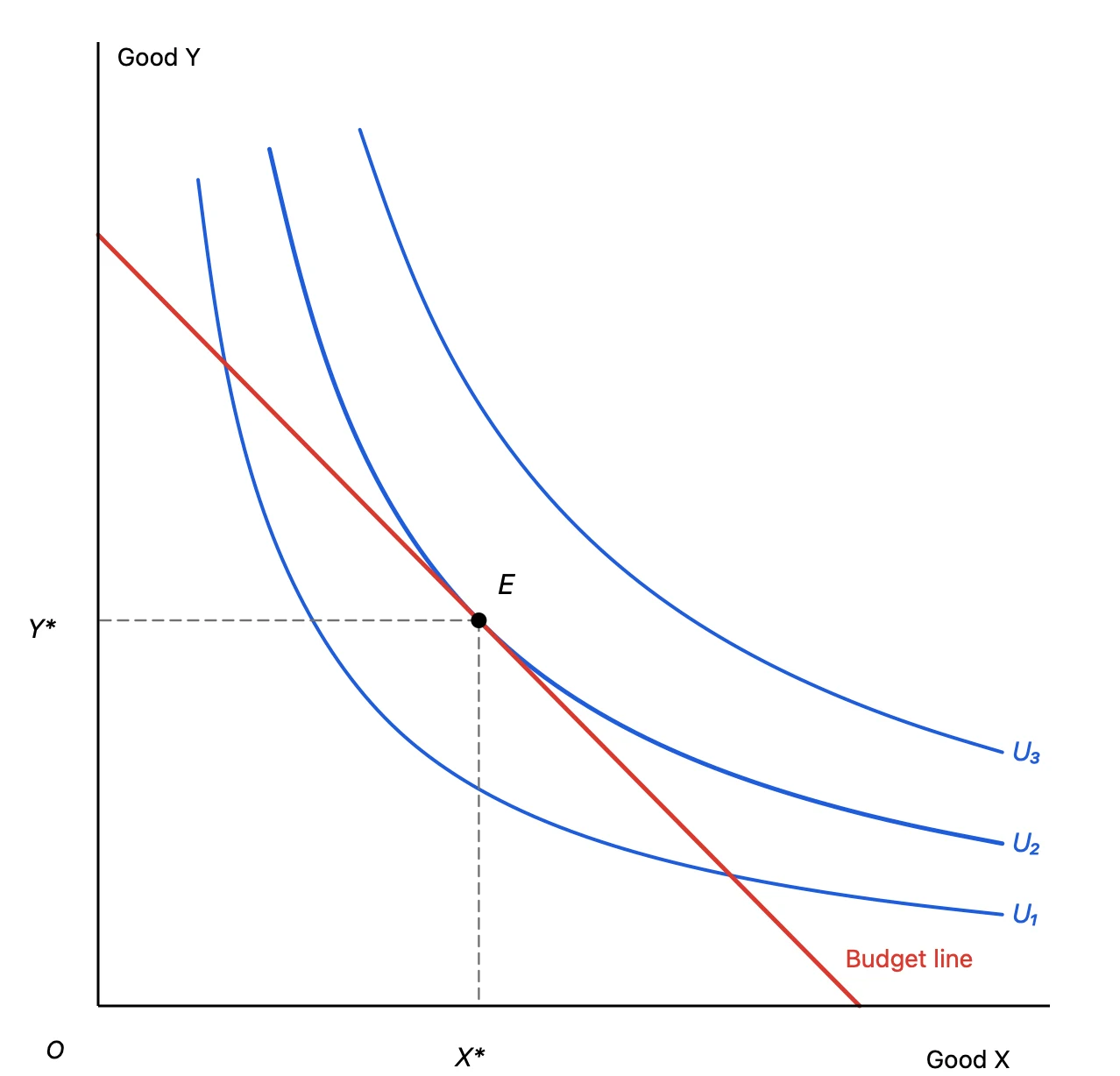
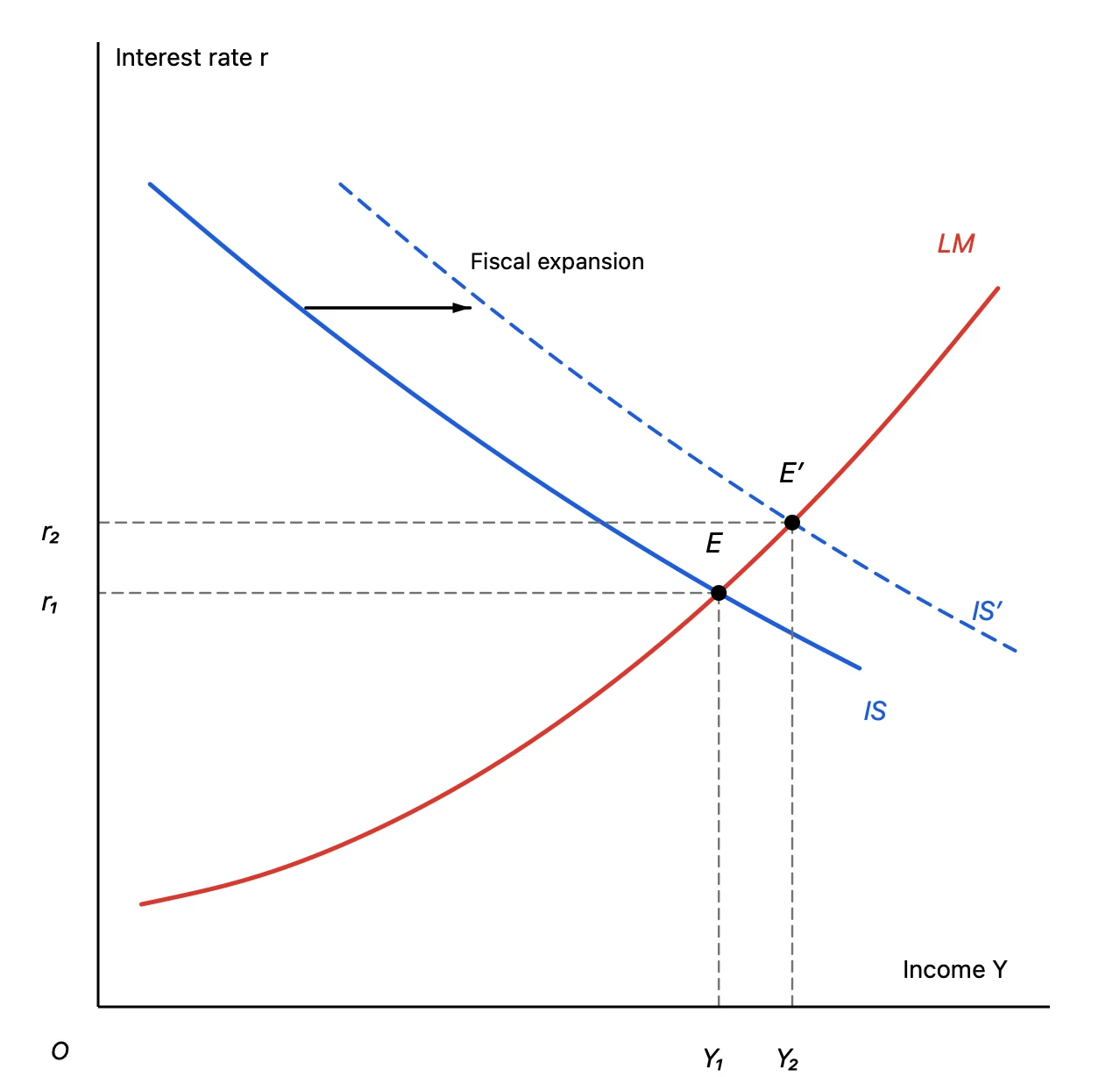
Economics lectures, papers and slides are full of graphs that explain a shape: supply and demand, cost curves, indifference curves. What matters is not precise data but the shape of each curve, where curves cross and what a shaded area means.
Yet these graphs are surprisingly awkward to make. Excel can’t draw a curve without data, and the shape tools in presentation apps make smooth curves and shaded surplus areas fiddly. Graph Sketcher is a Mac app that turns the shape you sketch by hand into a clean graph. Export it as a vector PDF and place it straight into PowerPoint, Keynote or Word.
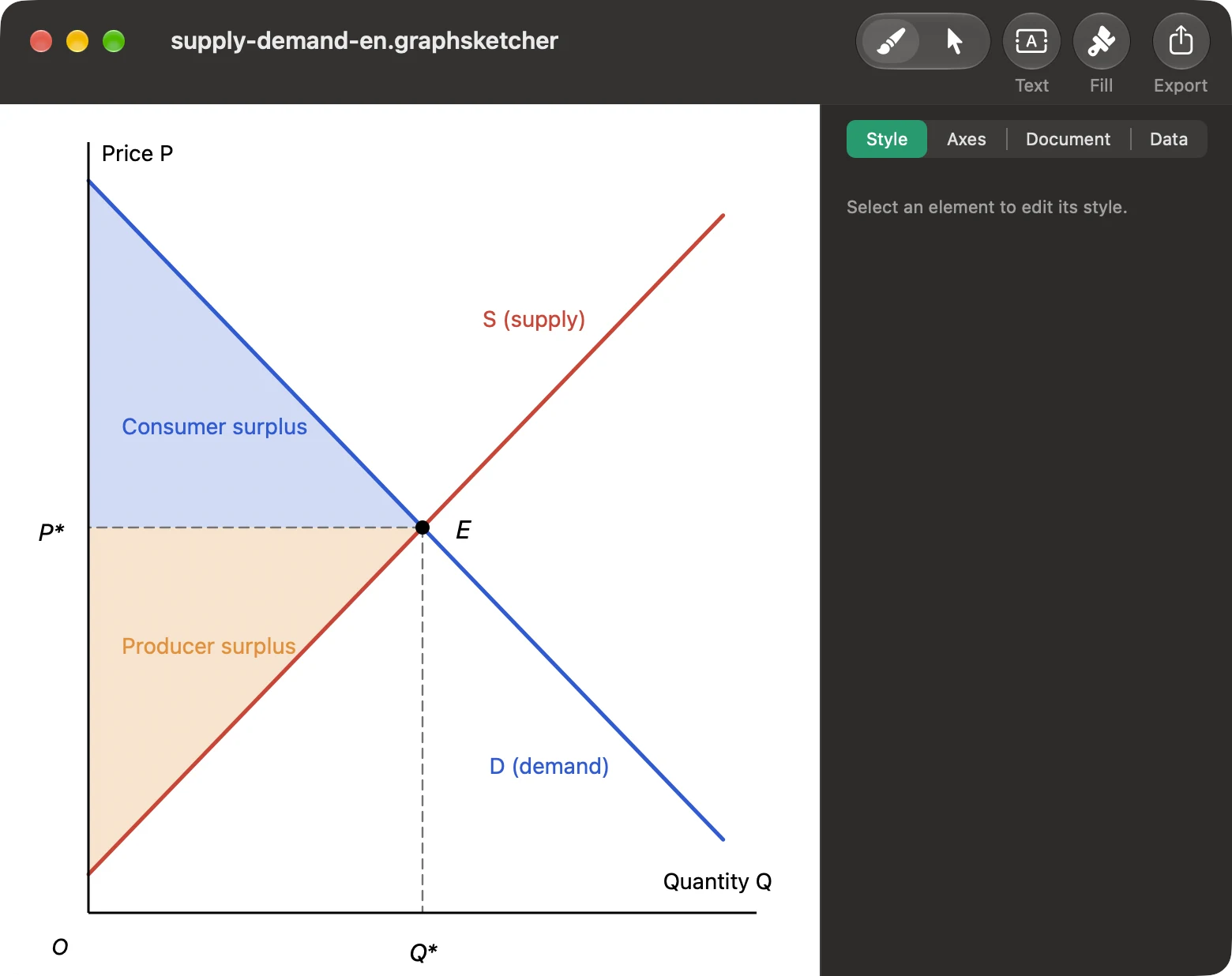
Economics graphs made with Graph Sketcher
Every graph in this article was made in Graph Sketcher and exported as a PDF.
How to draw them
1. Set up the axes
In the Axes tab, set the range of the X and Y axes and turn ticks, tick labels and titles on or off. For a concept diagram, the classic look is to hide ticks and labels, keep just the axis lines and add names such as “Price P” and “Quantity Q” as text.
2. Draw curves by hand
With the Draw tool, drag across the canvas and your stroke is rebuilt as a smooth curve that keeps the shape you drew. For straight lines such as linear demand and supply, click to place two points. Afterwards, switch to the Modify tool to drag points or add points on a line and refine the shape.
3. Change line colors and styles
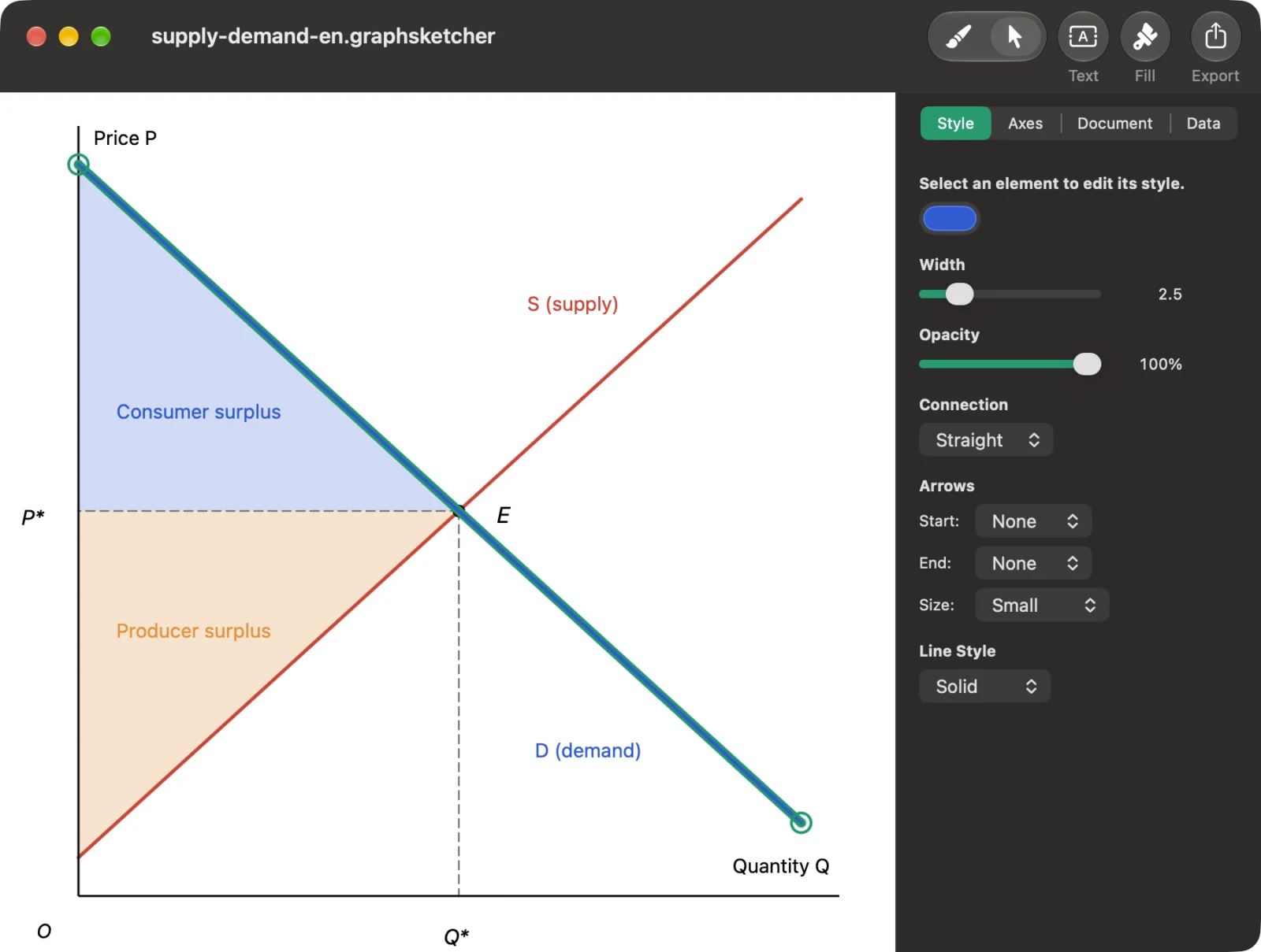
Select a line and the Style tab of the inspector shows its color, width, opacity, straight or curved connection, arrows, and solid, dashed or double style. Make the guide lines from the equilibrium to the axes dashed, or draw a shifted curve as a dashed line — just like in a textbook.
4. Labels and fills
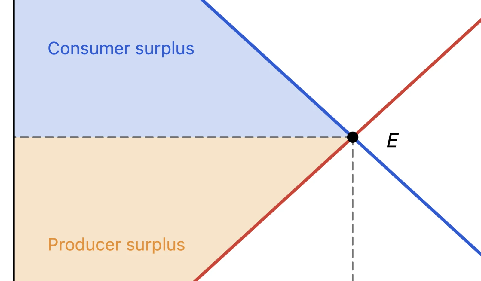
Use Text to place labels anywhere. Set symbols such as P* and Q* in italics so they read like math. Fill colors the area enclosed by a line, with adjustable opacity — ideal for consumer and producer surplus or a deadweight-loss triangle.
5. When you need exact values
The Data tab lists the coordinates of every point. You can type values directly, so placing the equilibrium exactly at (5, 5) is easy.
Export as PDF and place it in PowerPoint
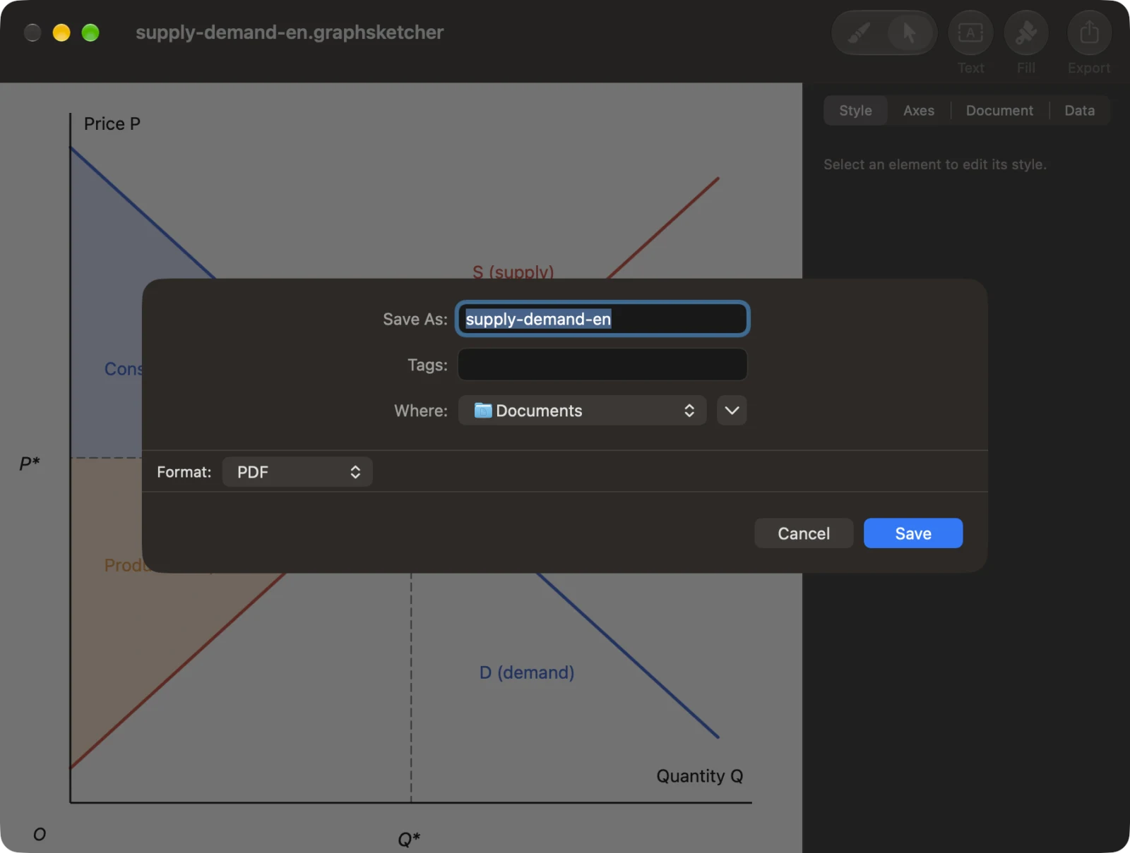
Click Export in the toolbar, choose PDF as the format and save. A PDF is vector, so lines and text stay sharp however far you zoom in. PNG, JPEG and TIFF are available too, exported at 2× resolution.
In PowerPoint for Mac, choose Insert → Pictures → Picture from File and pick the PDF; it goes onto the slide as a picture. Keynote and Word work the same way. If you write papers in LaTeX, include the PDF as is with \includegraphics.
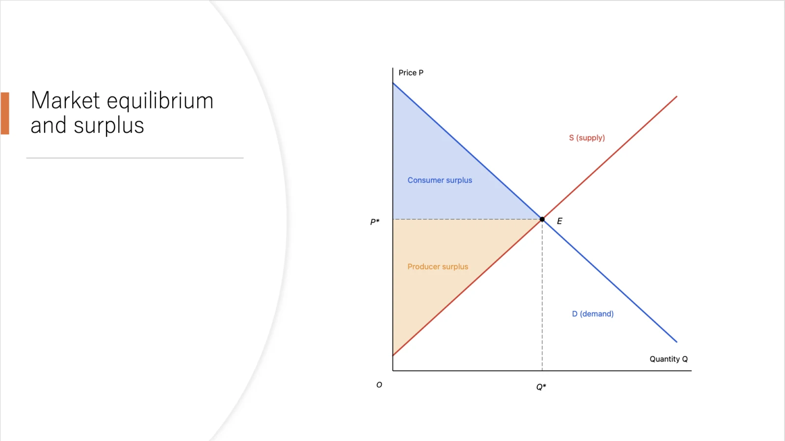
When you need a slightly different graph for each lecture, duplicate the Graph Sketcher document, edit it and export again — every figure keeps the same look.
Price and requirements
Graph Sketcher is available on the Mac App Store. Every feature is free for 3 days from first launch, then it’s a one-time purchase. There is no subscription. It requires macOS 14 or later.